Bedroom Color Palette Ideas: 8 Combinations That Actually Help You Sleep
Sleep-researched color palettes for the bedroom — from sage and cream to muted terracotta — plus the paint sheen and lighting pairings that make each one work.

The bedroom is the one room in the house where color has a measurable job to do: help you fall asleep, stay asleep, and wake up without wanting to hurl your alarm across the room. After painting more than sixty bedrooms in the last decade — my own, clients', friends' — these are the eight palettes that consistently work, and the small decisions that make or break each one.
Why bedroom color matters
Color affects perceived light, perceived temperature, and — more subtly — perceived heart rate. Cool, low-saturation colors slow the eye down; hot, high-saturation colors keep it scanning. A bedroom wants the first, not the second. That doesn't mean you're limited to gray. The eight palettes below are all "quiet" in saturation even when they look rich, and each one has been tested in real bedrooms with real morning light.
1. Sage green + warm cream
The most forgiving bedroom palette on the list. Sage sits between green and gray, so it reads as color without ever feeling loud, and warm cream keeps the room from going cold at night. Pair with oak or walnut wood tones and linen bedding in unbleached ivory. Avoid glossy sheens — this palette needs matte or eggshell to stay soft. Works in every direction of light, but sings in north-facing rooms where cooler grays would feel bleak.
2. Muted terracotta + plaster
Warm without being loud. A muted terracotta accent wall (behind the bed only) plus a plaster-pink or oatmeal on the remaining walls creates depth without shrinking the room. Ground it with a dark wood bed frame and cream bedding. This is my go-to palette for west-facing bedrooms — the terracotta comes alive at sunset and the plaster keeps mornings soft.
3. Deep navy + oat
The most dramatic palette that still qualifies as restful. Navy on all four walls (yes, all four) with oat-colored bedding, brass hardware, and a single warm-white bedside lamp. Counterintuitively, dark rooms often sleep better than pale ones because they mute morning light. The trick is picking a navy with warmth in it — Farrow & Ball's Hague Blue or Benjamin Moore's Hale Navy — not a cool, corporate navy.
4. Greige + soft white
The "I don't want to think about it" palette. A warm greige (Sherwin-Williams Agreeable Gray, Benjamin Moore Revere Pewter) on the walls, soft white on the trim and ceiling, and whatever bedding and art you already own will probably work. Best for rental bedrooms or spaces that need to please multiple people. The mistake to avoid: pairing greige with a cool-white LED bulb, which turns the whole room green.
5. Dusty mauve + taupe
Underrated. Dusty mauve is what happens when you take a rose color and drain 30% of its saturation — it stops feeling feminine and starts feeling architectural. Pair with a slightly darker taupe on the ceiling (yes, the ceiling) for a room that feels like a hotel suite. Linen or velvet bedding both work; avoid shiny satin, which fights the muted palette.
6. Clay + cream
Warmer than terracotta, calmer than orange. Clay walls with cream bedding and natural woven textiles — a jute rug, a rattan bench, a linen throw — create a Mediterranean bedroom that reads as relaxed rather than themed. Perfect for bedrooms that get a lot of afternoon sun; the clay absorbs the light instead of bouncing it around.
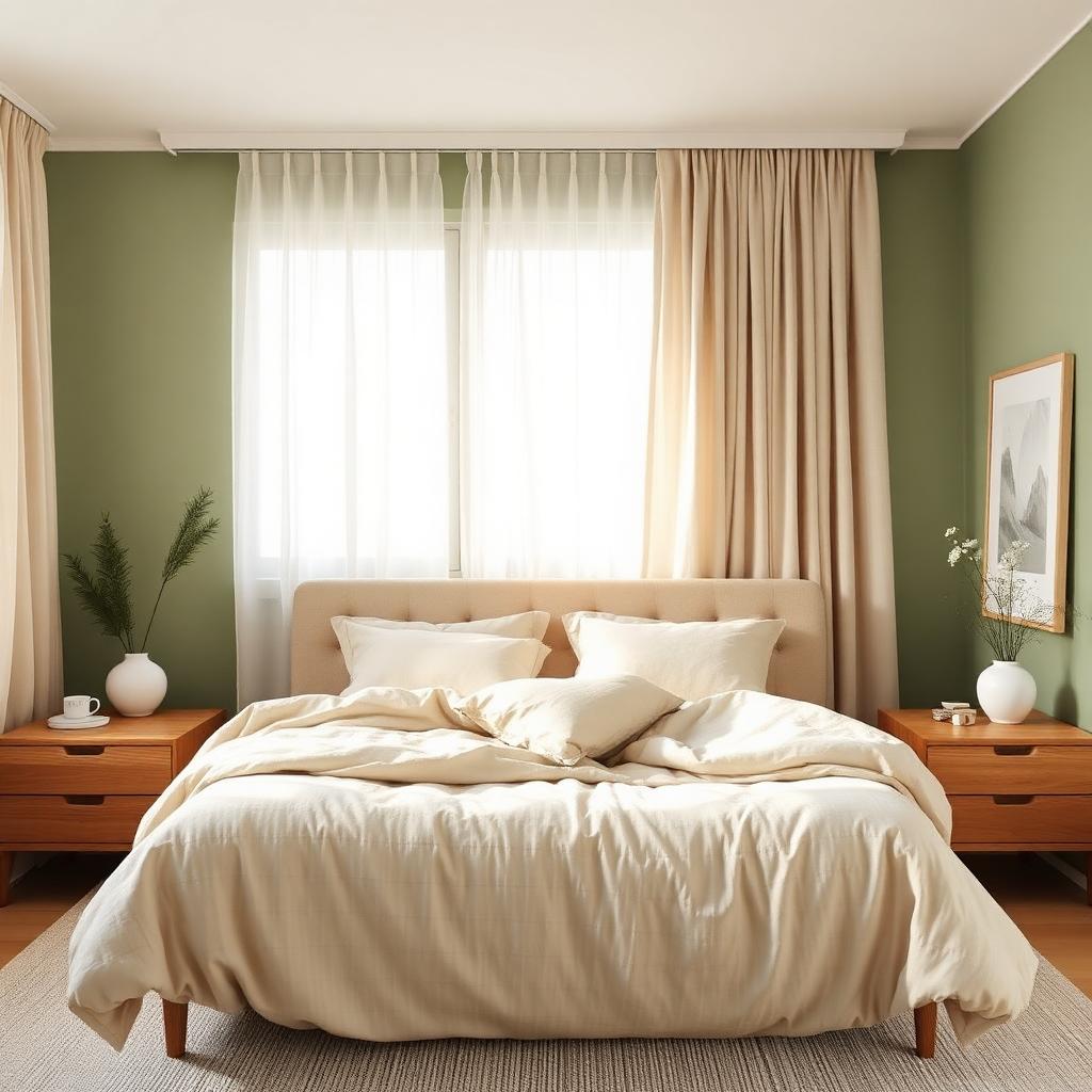
7. Forest green + brass
The masculine cousin of sage + cream. A deep forest green (not emerald — too cool, not olive — too yellow) with unlacquered brass hardware, warm white bedding, and a leather headboard if you have one. This palette photographs beautifully but requires warm bulbs (2700K or lower) to look right in person; cool bulbs turn it into a dentist's office.
8. Charcoal + linen
For people who love a dark bedroom but find navy too "coastal." Charcoal walls, linen bedding in oatmeal, a natural wood floor, and one large piece of black-framed art. Add a warm-toned reading lamp — the contrast between the dark walls and the pool of warm light is what makes the room feel like a retreat instead of a cave.
Sheen and finish
Regardless of palette, bedroom walls almost always want a matte or eggshell finish. Satin and semi-gloss reflect light, which is the last thing you want at 6 a.m. Ceilings should stay flat white or a shade lighter than the walls — never darker unless you're deliberately going for the hotel-suite look in palette 5. Trim can be eggshell in the same color family as the walls (a subtle upgrade) or the standard soft white.
Lighting is half the palette
The most beautiful paint color will look terrible under the wrong bulb. Every palette above assumes warm-white bulbs in the 2700K–3000K range. If your bedroom uses 4000K or 5000K "daylight" bulbs, swap them before you swap the paint — it's cheaper and often solves the problem entirely. Add a dimmer to the overhead light and a warm bedside lamp, and even a mediocre paint choice starts to look intentional.
Test before you commit
Paint two 2×2-foot swatches on the two walls that get the most different light (usually one near the window, one across from it). Live with them for at least 48 hours, checking morning, afternoon, and evening. Colors shift dramatically across a day, and the swatch that looked perfect at 3 p.m. can turn green at 7 a.m. Sample pots cost less than a movie ticket and save entire weekends of regret.
Frequently asked questions
- What is the best color for a bedroom for sleep?
- Sage green, muted blue, and warm neutrals like greige and oat consistently perform best in sleep studies and in real-world use — the common thread is low saturation, not a specific hue.
- Should bedrooms have dark or light walls?
- Either can work. Dark walls mute morning light and feel enveloping; light walls feel airy but require blackout curtains for good sleep. Match the palette to your lifestyle, not to a rule.
- What color should I avoid in a bedroom?
- Bright red, hot orange, and high-saturation yellow all raise perceived alertness. Even as an accent wall they can make winding down harder.
Frequently asked questions
- What is the best color for a bedroom for sleep?
- Sage green, muted blue, and warm neutrals like greige and oat consistently perform best — the common thread is low saturation.
- Should bedrooms have dark or light walls?
- Either works. Dark walls mute morning light; light walls feel airy but need blackout curtains for good sleep.
- What color should I avoid in a bedroom?
- Bright red, hot orange, and high-saturation yellow raise alertness and make winding down harder.